
Brand Building:
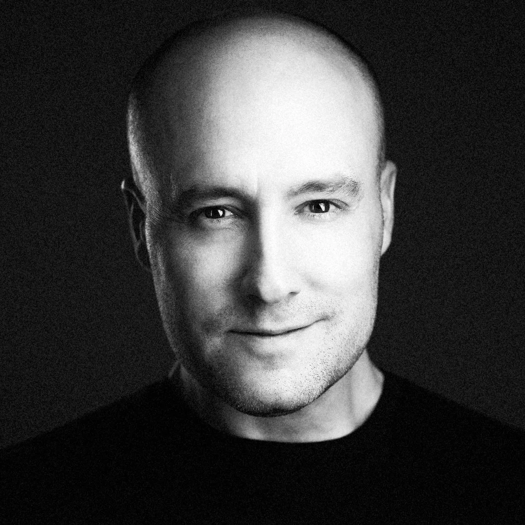
Shane Parrish is a former intelligence officer turned investor whose podcast, The Knowledge Project, consistently ranks among the world’s top shows for mastering the best of what other people have already figured out.
the knowledge project podcast
the Approach
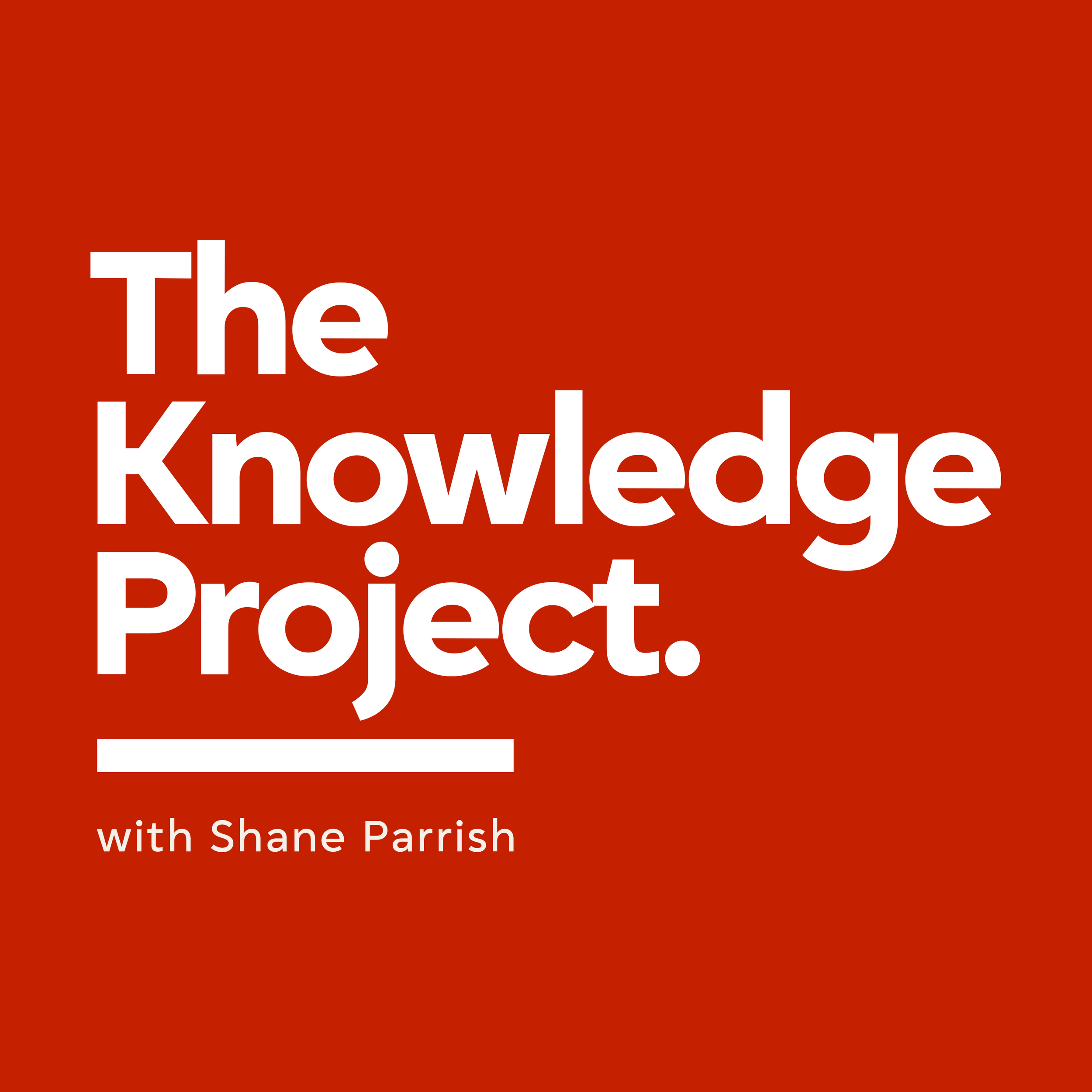
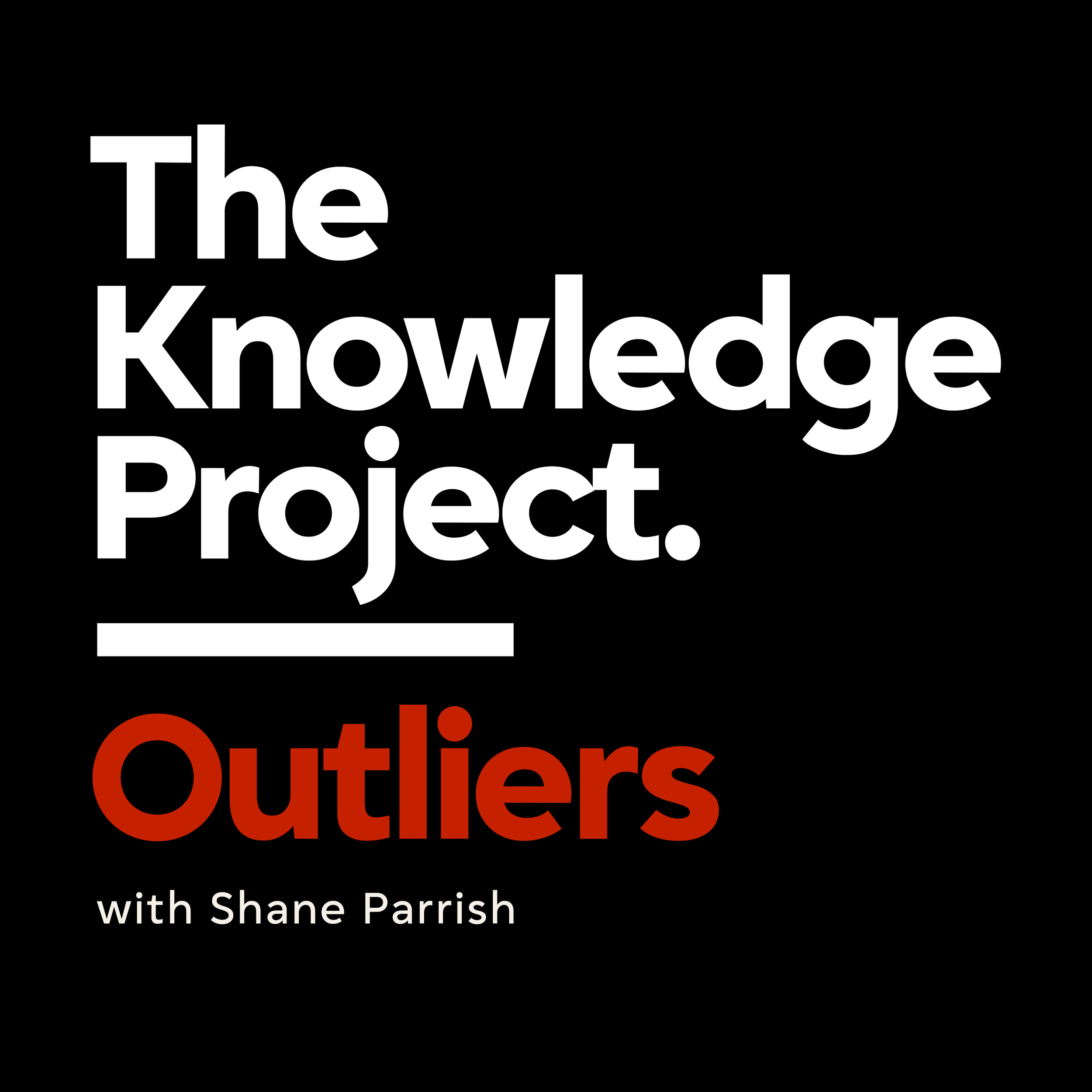
The big idea was simple: clean up, simplify, and create one consistent look and feel for the show across every podcast platform. The brief also called for branding two shows—the flagship Knowledge Project and its short-form companion, Outliers. The two needed to read as one family, yet stay distinct enough to tell apart at a glance on a small thumbnail. Every decision worked toward that single test.
it began with branding
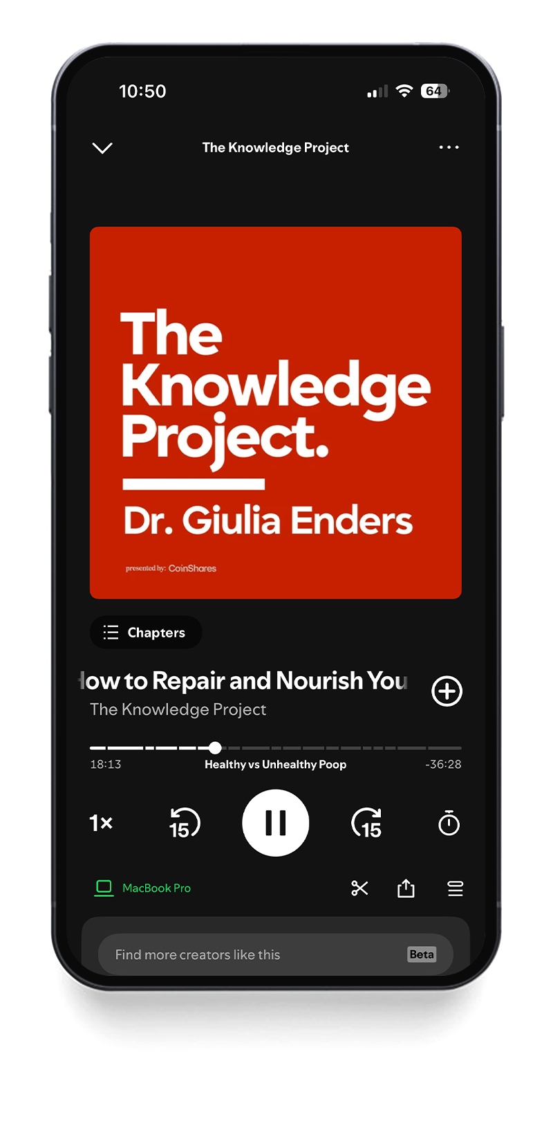
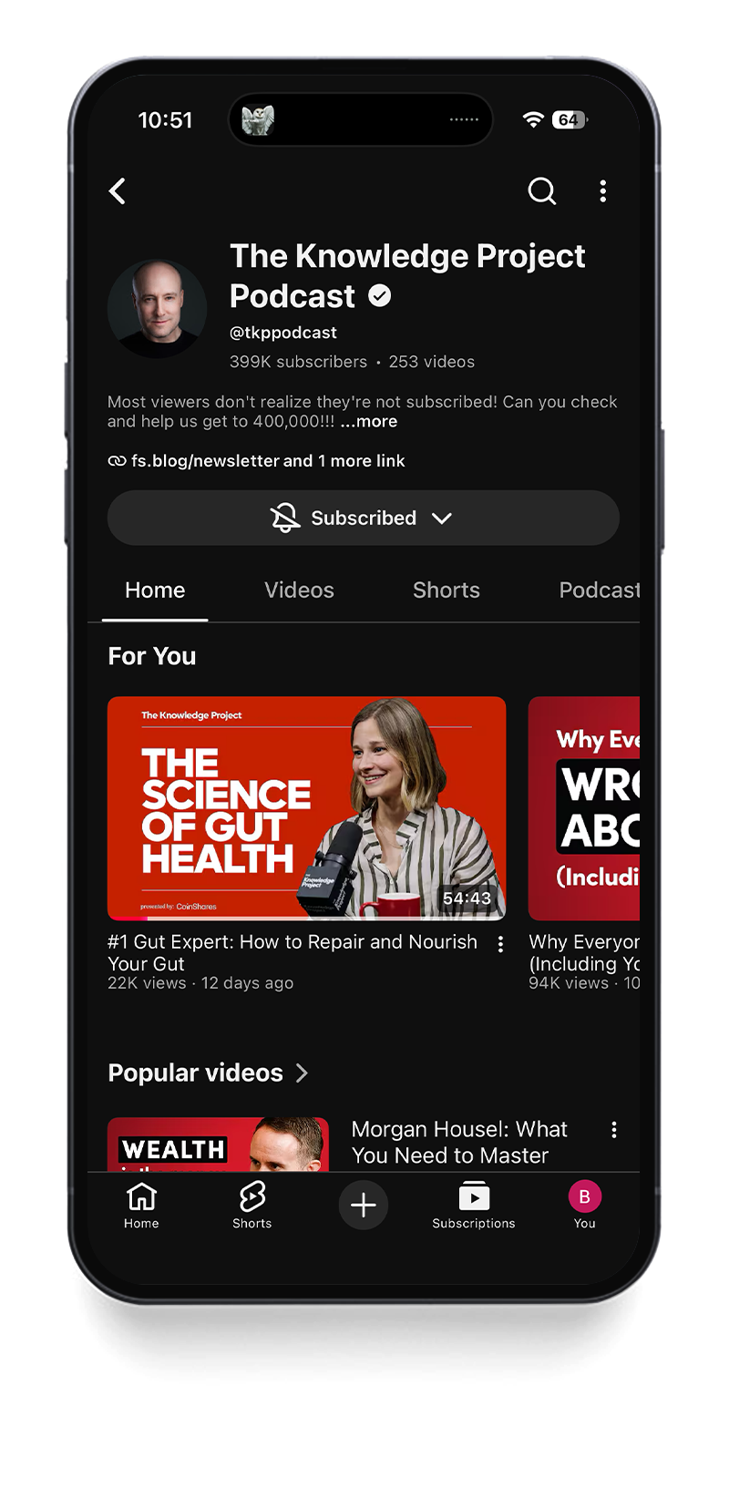
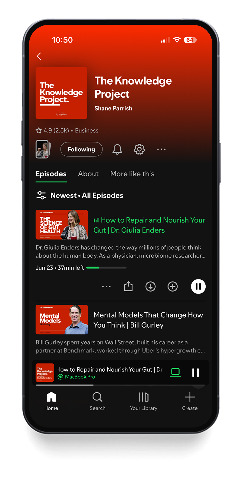
ONE BRAND, TWO SHOWS
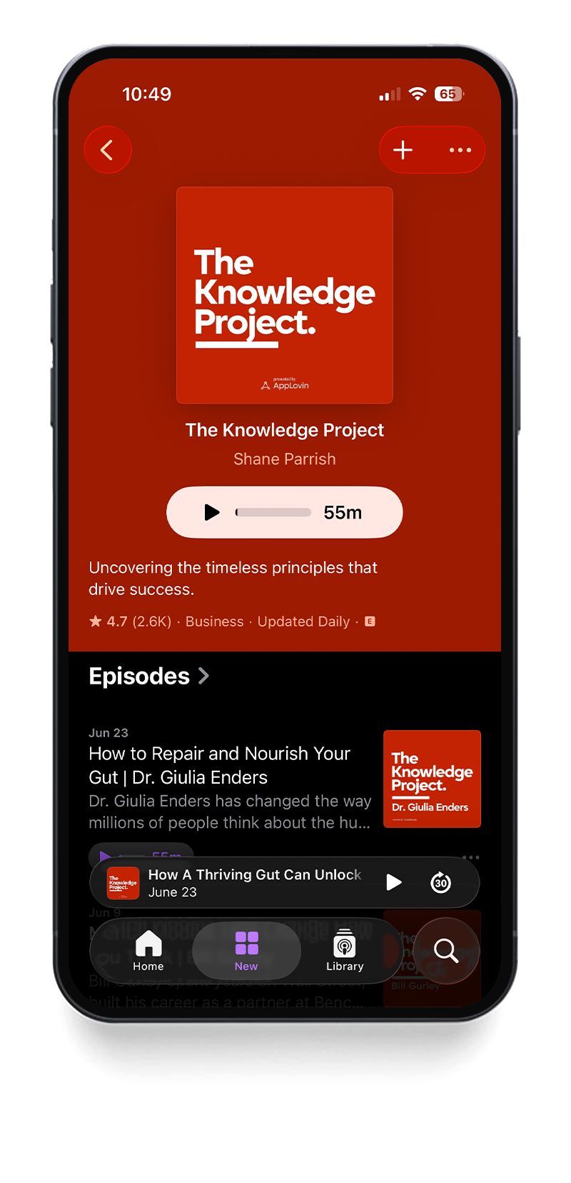
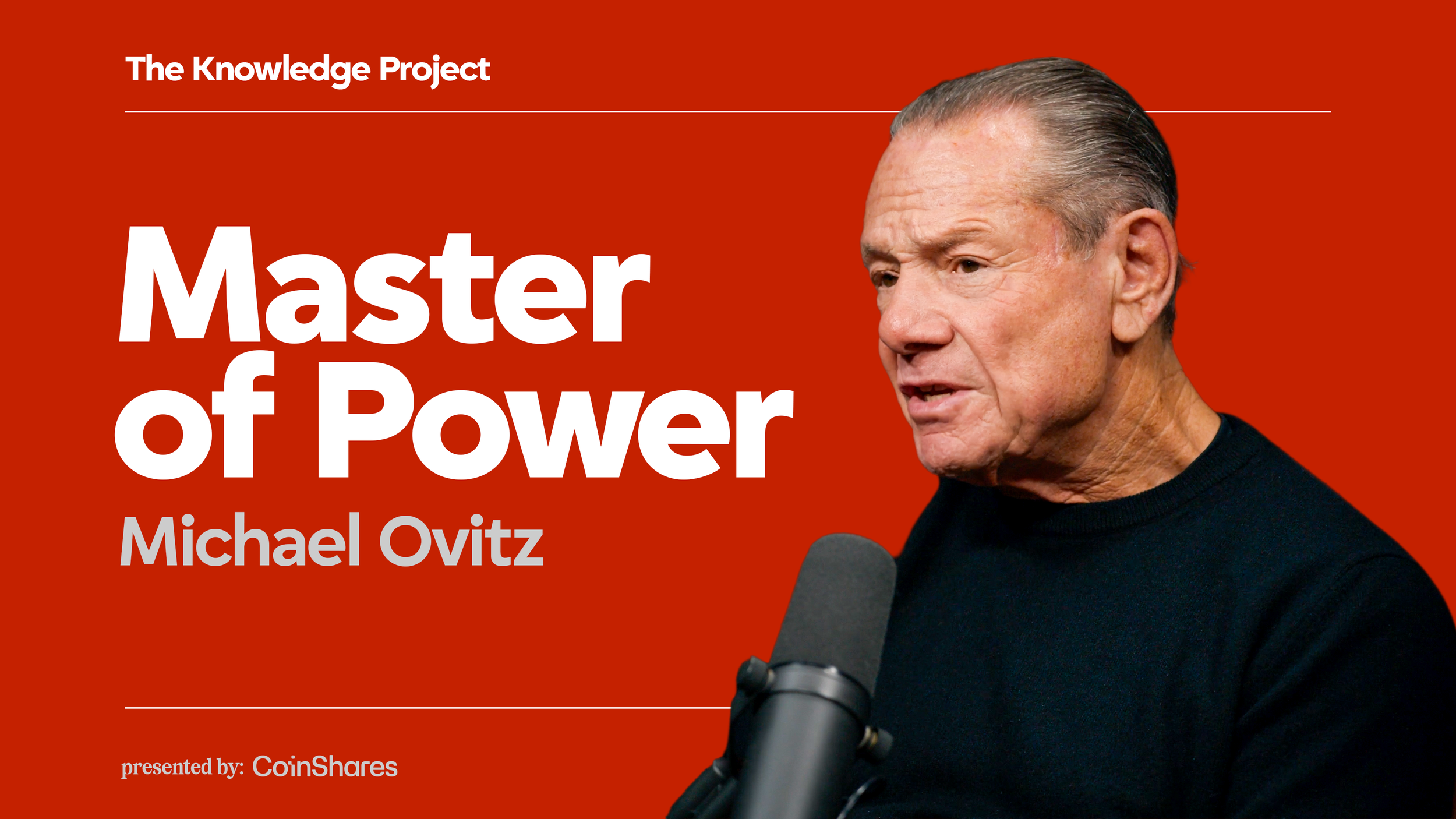
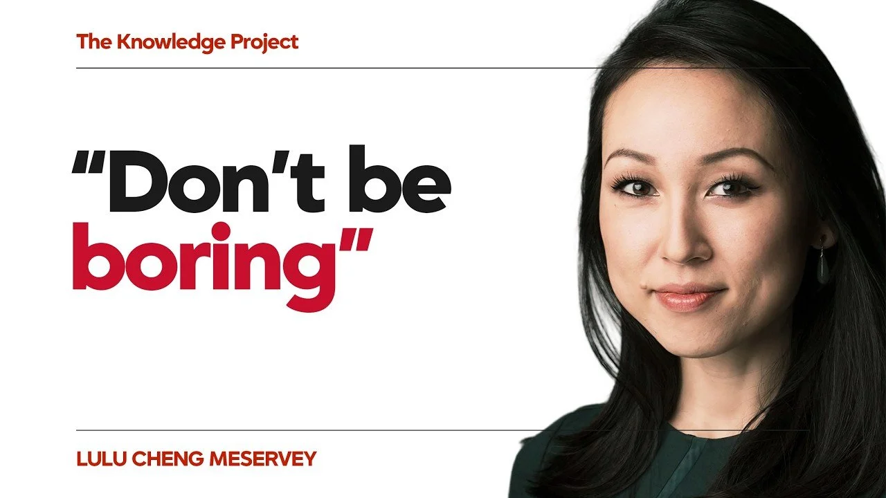
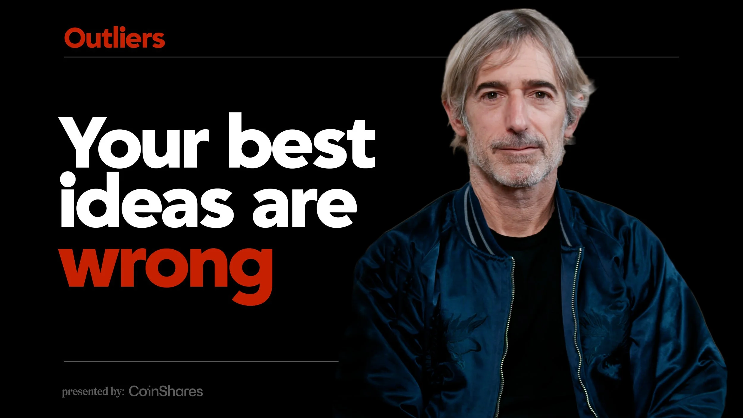
The Knowledge Project and Outliers share the same typographic voice, the same red, and the same discipline—but each carries its own signal. Side by side in a podcast feed, they read as siblings. Alone on a small thumbnail, there’s never a question of which show you’re looking at.
EVERY EPISODE, INSTANTLY RECOGNIZABLE
Episode artwork was built as a strict system—one grid, one type treatment, one red—so that every guest, every week, ships looking like The Knowledge Project. The system flexes for sponsors and platforms without ever losing the brand.
Built to move
The identity was designed to live in motion from day one—episode intros, animated lower thirds, and end cards that carry the same restraint as the static system. Nothing decorative, nothing wasted: motion shows up to guide the viewer, then gets out of the way.